
CONGRATS
Qamel.
Task 4
Too
bright
CONGRATS
xKimiex
Welcome to Task 4 of Builders Corp. Series 2. This week we are reintroducing a fan favourite task from Series 1. Light is your inspiration for this build. Setting the scene with a build that takes place during the night; add features that illuminate.
Click below to see how you can achieve this, also check out the builds from Series 1.
Remember, creativity is key.
MAX ROOM SIZE LIMIT:
5x7
SUBMISSIONS

..havermout..


The idea to light up all these small details scattered around the room is really impressive especially framed around this beautiful scenery. The life growing around that sunken ship feels very organic and using just one wall in one side really helps in framing this creation. Beautiful work with a unique use of light.
The use of light was cleverly introduced in this build. The bioluminescent aspect really plays off the theme of the room giving it a great sense of clarity and cohesion. Very ethereal. I really enjoy the stacking and layering of all these beautiful colours and textures. Overall this is a complete build that holds a lot of creativity. Very well done.

What a powerful room. You were one of the very few who used the light aspect of the task as a tool to enhance the ambiance of the room. It might seem like a simple room but you thought of so many aspects like what gets hit by the light and giving the spot you want lit a colour tint. Impressive work.
A simple concept constructed beautifully. I'm amazed by how natural this setting looks. The tone of the room is relaxed and calming, the light from the television really works with that idea. This is definitely the best use of light this week. The vision was clear, you knew where you wanted the light to hit; it's very creative. The more I look at it the more details I see. Awesome.
xKimiex

Qamel.
I do have to say nature rooms and exterior building rooms are very safe choices for this task. They could still work out if the light aspect is applied really well in unique ways. What you gave us is very on the nose. I’m glad to see someone use the tokyo furni line in a not messy way, the general feel of the room is quite nice but overall I’m not impressed in terms of this particular task.
I tend to enjoy darker constructive builds, I see some redeeming qualities to this design; I wish you gave us a little more to work with. Neon signs is very obvious in a task like this. Had you played around with more furniture items that don't normally light up, this would have been able to stand out a little more. That being said, the overall construction is crafted quite nicely. The mixture of walls/pipes are incorporated into the build appropriately. Overall I think you missed the mark on this build, I still think you have it in you to bounce back. Thanks.
I

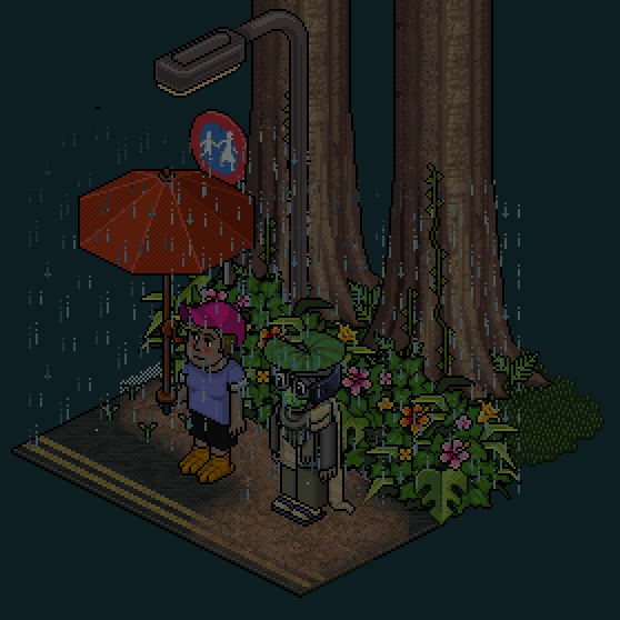
Pine
I can tell you were quite rushed in making this room. I wish you applied the light aspect of the task better. The lit up stuff are quite odd. That being said I personally really enjoy this room as a whole. I could see this being used in a gritty cyberpunk video game. I just wish you had more details.
I really enjoy the architecture in this room, you've collaborated so many different furniture items into the construction of the building. Nicely done. The rain sets the tone of the room and it works really well with the light you decided to add to the room. That being said, your use of light wasn't 100% there for me. The strips shining on the sidewalk are glorious and definitely your saving grace. I think the neon sign is redundant. Had you asked us to light up the windows, I think this would have been amazing.

Malinhi
You did listen to our previous critiques and went with a more organic shape. I enjoy that quite a lot. The candles and lanterns are a somewhat safe choice for light sources. The room is cute but I also feel like it is missing a completing aspect. Maybe if the light sources were spread out more and sorta balanced around the room and not shoved so heavily in one spot. Overall it's an impressive but safe piece of work.
I'm very drawn to this concept. The natural path you've been able to weave through the construction was a nice touch. I really love the room shape. Your concept is fairly obvious and I commend you on that. I do wish you added a light source that wasn't so pronounced as the candles are. I think this hits close to what we were looking for this week but maybe not close enough. Keep at it!

A room full of ambiance and colour. The warm tones spread around are the best thing about this room. I do think you lack a bit in the light aspect of the task. Light doesn’t really do anything for it. I feel like the room looks way better on its own.That aside I can’t really score down such an impressive room.
Your story telling is much to be admired. I think you've done an excellent job setting the scene with this build. I really enjoy the earthy tones spread throughout the room, it ties everything together. I wish you showed us where the light from the projector was going, being so close to the edge of the room, it gets swallowed up in the void of what we cant see. Had the projector been behind the sofa, you would have been able to get some really intricate shadows and movement around each furniture item placed. I urge you to not limit yourself to the entire room size limit. Good job.
taromilkshake

Faithzina
The room overall is a cute creation with matching colours and themes. What it lacks is utilizing the light aspect of the task at its fullest. Looking at the previous season light rooms you could clearly see nature rooms + light gives you very safe unimpressive rooms. Like I said this is cute for a hangout room but not a complete work for this competition.
This pails in comparison to some of the more constructive builds we've seen this week. The aesthetic is cute and prim; I just don't see the light as the focal point. It all seems a bit distant. The flowers make no sense to me, I don't love the floor lights. The aspect I like the most would be the trees, the twists are very organic and the swing fits beautifully. Overall I think you could fine tune some of your constructive aspects into a more clear concept. Try building smaller renditions of our tasks, you might find you have more ideas tucked away. Thanks.

Sci Fi rooms are a bit tricky. I can appreciate the work you did especially in matching the purple/blue tones but overall the choice for this room is odd. The light aspect is somewhat dull.
The flag detail just reads wrong and unimpressive. I do like the details on the side building and I wish we had the same organic feel of it spread out on the tower too.
I see the route you were going with this build. It seeps creativity and the way it's crafted is nicely done. Had this been a different task I could see this being a top build. However, I feel for this task; one in which we asked you to give us a light source, this fails to impress me. I'm just not seeing how this holds up in a slew of builds that incorporate a more pronounced use of light. It almost seems like an afterthought. Overall I think this is very well done, the tower is so cleve. Just the light source isn't there for me. Thanks.
ben63395

tallmolly08
This is a marvellous creation perfectly fit for this particular task. I can see the heavy inspiration of pinoy style buildings on habbo. (for those who are not aware, pinoy habbo rooms are a certain style filipino habbo players use on their rooms. It’s very impressive and you should check some of them out.) The simplicity and grittiness of the room really play out when you add the light ambiance. You even thought of giving the sections where there's light a reddish hue for a better effect.
I love this construction, the light source is very prominent and obvious but it plays well with the shape of the room. The hue of the light shining down is so pretty and it matches the neon sign quite nicely. I can only imagine if we made this into a gif, the neon light flickering; how well the scene would be set. The smaller details spread throughout are very well placed. Overall this holds up as a top design in my opinion. You did a fantastic job honing your skills into something that looks so unique.
CONCLUSION
Thank you for all the hard work this week. I know it was a hard task to follow, considering you weren't sure how the end result would look. You all did awesome.
A special congratulations to xKimiex, this is your second win in this competition, you're a force to be reckoned with. Keep up the good work. We are also saddened to see ben63395 eliminated from the competition. You've been a pleasure to critique, we hope to see your builds in the future, and we know we will! Thanks.
Please click the button below to send you to the progress page.