CONGRATS
Qamel.
Task 1
CReATE
your space

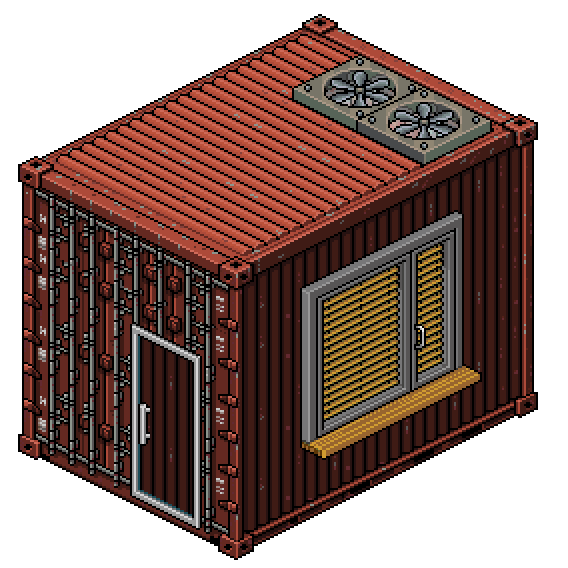
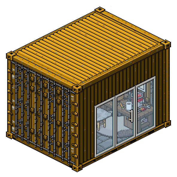
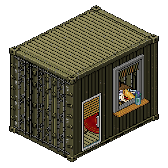
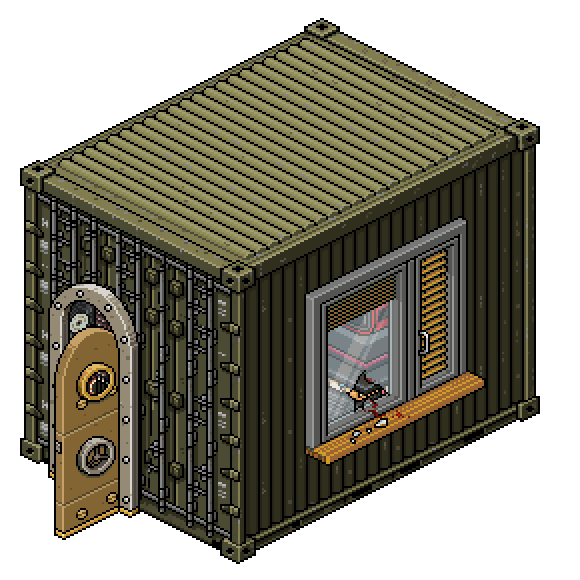
Welcome to Task 1 of Builders Corp. Series 2. We urge you to create an original build of your choice to be displayed in a shipping container. The limitations are vague as it is imperative that we see your individual creativity and construction.
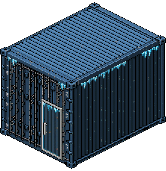
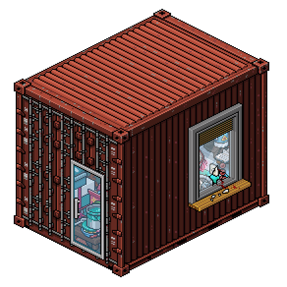
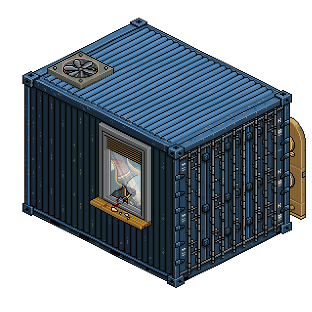
Ulterior editing will take place to ensure your builds fit the crates (shown below). Any wall/floor space not covered by furniture will show the interior of the crate. Finally the build will cover a 3x4 floor plan.
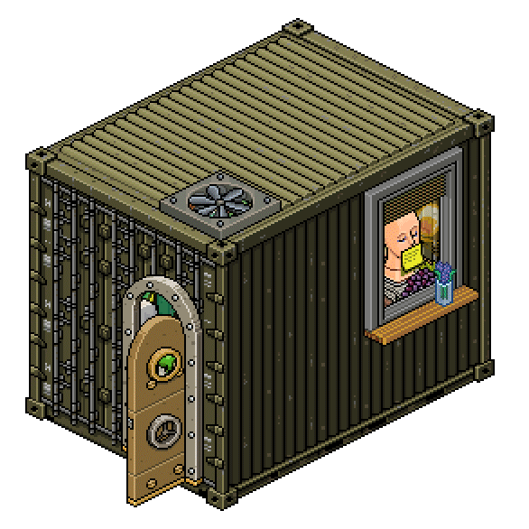
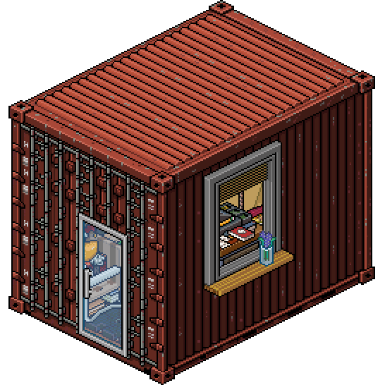
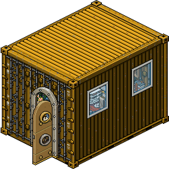
Below we have asked our Top 3 contestants of Series 1 to demonstrate how this task will play out. Good luck.
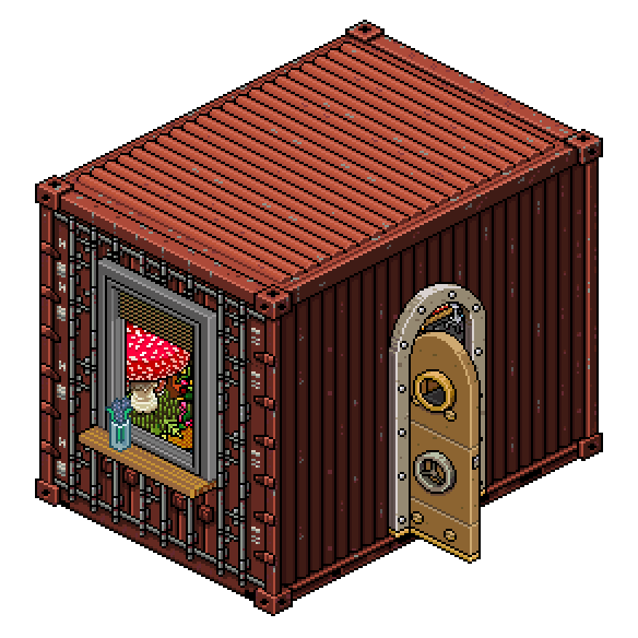
Cover built by OstrichCurtains
CONGRATS
..HAVERMOUT..
True-Courage
Babycakes
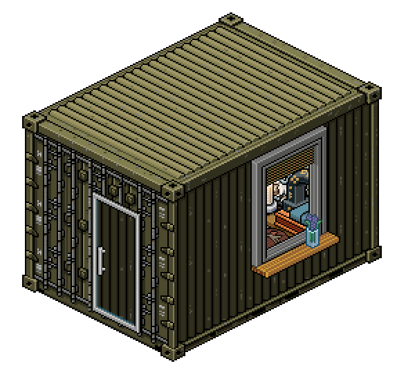
Doglover53
NOTE
The above room builds were created to demonstrate how this task will go. Please do NOT copy them. If any furniture item exceeds the allowed space, it will be cropped out. (Keep that in mind.) Wall height will be standard size 1
Your builds will be edited into crates after you submit.
Please refer to the Tips page if you want more information on how to leave your room for us to screenshot.
If you have any questions regarding submitting screenshots, we will be happy to answer them!
ROOM SIZE:
3x4
SUBMISSIONS
As a reminder, these critiques are constructive. By no means necessary do we intend to discredit a builders ability. All opinions expressed are not subjective; we simply relate the builds back to the original task. Creativity is key. You're all exceptional builders. Each week starts with a clean slate.
Happy Reading!

Faithzina
tallmolly08

What a vibrant room. The mossy plant details are to die for. They’re well thought out in terms of matching the tone and color of the greens. The browns and blues act as a nice palette attached to the greenery. It is a rather nice concept for a crate room. That being said, I do have some issues that I would like to point out. I think you have balancing issues here. The room is organic in terms of theme but the flow of the room is overwhelming. I feel like if you removed or replaced some details like the rug/monster plant bed/left shelf with subtle details, then the room wouldn't look so overwhelming. An ok room with huge potential. Can’t wait to see your progress.

The foliage is immaculate; your perception is comforting. I enjoy the technical aspects that tie this build together. The use of greenery on the walls sets the tone of the room. I think having the walls closed in was a smart choice, it ties the palette together and unifies everything you have going on. Had you removed some unnecessary accessories, I think this would have scored higher. Overall good job.
The green in this room is really well matched, I’m impressed by the detail you’ve put into the walls. It’s a cute room however really jampacked with stuff that I almost feel is random, not a big fan of the rug (wouldn’t it get dirty with all the plants around it!!) Nothing awe inspiring but a well made room, could be more thought through, a little extra time could’ve made this room really nice.

What a strong first impression. By simply stopping and analyzing the details, you can see all the work you put into this. There are just so many details done in the most subtle of ways where they don't smother the room. The room has an organic flow, fits the crate idea and overall its balanced quite well. That being said I do think you overdid it a bit with the stickies. They lowkey stand out a bit too much. I respect the work you put into this and can’t wait to see what more you bring to this game.
I was unsure when you described your original idea, however this turned out heaps better than I had hoped. You don’t always see a grunge room executed so brilliantly. I love the small details more than anything. The flow of trash on the ground is so articulate and appropriate. I like how you layered so many furniture items in your table; creating some very unique shapes. Awesome!
This is really nicely stacked together, however I’m not a massive fan of the idea behind it, I’m not entirely sure if it really fits the theme. The colours go together nicely it’s a pretty cohesive room. It looks pretty dank and abandoned which you’ve really captured but I’m not really sure what’s going on. Not a massive fan of the big butterfly on the wall, it seems a bit random. I love the small details though like the hockey stick and the small objects across the floor. Really nicely put together.
xKimiex
I adore this room. You have one the strongest concepts compared your peers. This is a perfect idea for a crate based room. The design is to the point and nicely fits your theme. On first glance the room looks simple, but it is packed with subtle details. The smoke not only fits your room, it also gives it a nice ambiance. You also went through all that trouble in making a base out of stacked crates. Keep it up+*`
This was so different from what we were seeing this week. I’m obsessed. I love the combination of furniture lines used to create this ‘scene’. The small details work wonders. I really do get that back room vibe from this build. I’ve never seen a room use fog in such an inventive way. You didn’t over exaggerate it in 1 specific way, you were logical in the sense that smoke would definitely fill this entire space. Genius! Very creative and inspiring. Can’t wait to see what else you build!
Such a different and exciting concept compared to most other entries! The fog throughout the room pulls the entire room together. Not the biggest fan of the vent blocking such a large portion of the room, could’ve been better higher up or further near the back of the room. Great colour coordination, cute details like the money on the floor, but I’m not a huge fan of the sparkly floor but it still works together!
Pine
Great idea for a room but unfortunately this isn’t one of my favourites. I do enjoy all the colorful toy details scattered around but they’re also the source of your problem here. To be more exact, it's the way they’re displayed. If you’re going to go with an over the top colorful concept then the rest of the room has to be almost monochrome and neutral in order to balance it out. What I see here is bright colorful details on top bright colorful stands. It’s overwhelming and busy.
I really enjoy all the thought behind this room, especially how you managed to collect such an eclectic grouping of ‘toys’ to feature in this build. The register area is portrayed well, the paper and books really set the scene. I’m confused by the structure in the corner with the chairs. I appreciate an inventive stack but I struggle to see how that relates to the rest of the build itself. I think downplaying that area and leaving it minimal would have balanced this build and we would have been able to appreciate some of the more subtle touches.
Creating a toy shop is a really cute idea, I love the little details you’ve tried to add in across the room, however it is all a bit crazy and I’m not really sure what I’m looking at. There’s some signs of a really good build in here but a lot of it is too much for my eyes to handle!! A good concept but the execution falls short. Try working with a colour palette of complementary colours to make your rooms more easy to understand.
taromilkshake
Conceptually, I'm having a hard time understanding the room. That aside this room is really adorable and unique. I appreciate all the neat details scattered throughout the room and the empty space gives the room quite a balanced feel. If i have to be nitpicky’ I'm gonna say the flower pots on the left corner are not my favourite. I can feel a unique point of view from this room and I can not wait to see what you’re capable of in the upcoming tasks. Welcome to builders corp.
I really enjoy the majority of this build! I think the use of the shelf on the wall was inventive and unique, the furniture stacked into it were placed very well! The shelving unit you have below is full of small details that make perfectly sense. The one aspect I’m struggling to see making sense would be the waterbed in the corner. I wish you had played with a hole in that corner to make it look like the crate is flooding with water (matches the windows) that would have been glorious! Overall a very strong build, concept wise it wasn’t 100% there!
Amazing stacking in this room, not too overdone and it’s kept nice and simple. I also love the details across the desk and the little indent above the desk, it all looks so creative! The idea of having a window to the outside is cute, however not a massive fan of the choice of window as the wood doesn’t really match the rest of the room. Overall a cohesive room, easy to look at, colours are cute.
Mogwai

Turning the crate into a music room was a great idea. Some of the details scattered throughout are nice and fitting and overall this is an ok room. What the room lacks is cohesiveness. Apart from concept the room also needs a theme to it. Maybe a forced color palette, a bit of structure to give it cohesion, or even adding appropriate furni for the chosen theme and nothing more. It is a cute room just needs more in order to stand out in this competition. Can’t wait to see the full potential of your designs.
This is a great starting point, I think you played with the conceptual side this week more so than the technical side. I would have liked to have seen some more articulate stacking. Try to stretch those creative thoughts to their biggest potential. Rather than just placing similar colour tones; really dive into the furniture habbo has to offer and stack some unique shapes/colour variations. I think you’ll nail it!
This concept has so much potential, but the execution hasn’t really pulled through. Not a massive fan of the random wall posters to fill up the walls. The furniture used is cute but there really isn’t much stacking going on here, so a pretty simple room. It definitely is a cute room I love the small details you’ve added with the vinyls but I feel like a lot more thought could have gone into this room.
..havermout..
One of my favourites of the week. Not only do you have a great concept for a darkroom crate, you enhance it further will all the appropriate details scattered throughout the room. From the three old camera details to the photo printing corner. You even thought of the outer crate in terms of connecting it with the vents. Keep up the good work and welcome to the competition.
Very interesting. You grasped this task to its full potential. I adore the concept. Every furniture item placed was thought out; everything works well together to create this picture. No pun intended. The use of light was smart, the pictures on the wall are gorgeous and the curtains around the printing really tie it all together. I might have excluded some of the tiles on the floor, let the crate show through, but that’s just me. Great work!
This concept is so creative and really well executed, a dark room is something I could totally see someone converting a container into! You’ve implemented elements that really make it seem like the real thing - I really love the red light! Not a massive fan of the flooring, leaving the crate to show through might have tied the room together more, however it brings some light back into the otherwise dank room. You are a really strong contendant for this competition!
Qamel.
You’ve built a front runner here. The room is simply adorable to look at. The pot details are mesmerizing I especially love the clay rolling corner details. This is the first task so I’m gonna give you some constructive criticism. My least favourite thing in the room is the poster. It looks inappropriate and feels like you just added it for the sake of adding posters. I also believe the room would have been more interesting if it worked with the background more, rather than just covering the floor with cobblestone. Welcome to builders corp.
I’m obsessed with the palette. The earthy, terra cotta, greyscaled tones really vibe off one another. The concept is exceptional. I love the spinning table you’ve fabricated in the corner. Clever and fitting, had you not added that I think this wouldn’t have stood out as much. The stack of pots threw me off at first, I thought it was a bit excessive. After closer examination I realize it is a necessary addition; it adds to your overall thought process in creating your story. Exceptional!
The stacking in this room is phenomenal! The colours throughout the room are cohesive which really helps pull the room together. The space is used well and the details throughout the room are so creative like the pottery wheel and the pot painting station! The city backdrop poster seems a bit random like you’ve just tried to put a poster of the sake of having something on the wall, it would’ve looked better without it!
Malinhi

Such a good idea to have the crate turned into a painters lodge. You’re the only one who “thought outside of the box” literally by adding the open door detail. The room has an organic flow with mesmerizing subtle details in each corner. The work put into the details, no matter how subtle they are, is clearly obvious when you really look at them. Can’t wait to see more from you.
I really enjoy all the aspects combined in this build. An art studio is something so many builders have played with before, however you have combined so many unique elements into this construction it’s worth while. The easel is gorgeous. The furniture you used to create it is inventive! The paint underneath matching the palette of the picture is something a lot of people would overlook. It was the first thing I noticed. I especially enjoy the outdoor space you added to the crate. You really listened to our tips this week in creating more room than what’s actually given. Happy to have you in this competition!
I love this room! The attention to detail is amazing, the door leading to the outside, the little painting station, it’s all really artistic! The painted pots fit in perfectly with the room and give off that wet paint vibe. Really great stacking throughout the room and the colours are all cohesive! A really effective room for task 1!
ben63395
This room has some nice details and an overall warm feel to it. That being said I think his room does not fit the task at all. I can see this working in a wooden lodge cabin, not in an industrial metal crate. You do show potential here in terms of matching colors and theme throughout the room also in balance and flow. Unfortunately this was the wrong concept for the task.
I like the architectural risks you took in this build. I think the way in which you constructed this was clever and intriguing. I struggle to see a concrete concept. Had you turned this into some sort of study or menagerie perhaps this would have stood out more. The contrast between the pink and brown was nice to see. Overall I think you nailed the constructive side of this task; just solidifying a concept and working on more aesthetically pleasing additions was your downfall. Thanks.
I love tiny houses! This is really cute and petite and I love how you’ve tried to fit in everything someone might need in such a small space. Really brave choice of concept. However I’m not a massive fan of the execution, there aren’t many details throughout the space and the woods don’t really match. Not a huge supporter of the red rug either sadly. It’s all really cutely stacked together and I’m sure another hour spent on the room could’ve really made this house a home!!
Fierce.Needles
I’m having a hard time understanding this room. I do not see any concrete theme to it nor even an aesthetical room with a color theory. Everything is just.. random. The room also lacks in details. I don’t know what more to add. It’s one of the bottom rooms this week.
I'm very confused by this collaboration of furniture/stacking. The awnings weren't needed at all. You added several elements to the build that I think skewed the overall vision. Your initial idea to create a 'wine room' was tainted with your eccentric additions. Had you focused on more of a story within your concept; this would have worked better in your favour. A way in which you could have achieved that would to have been adding a sitting circle, pillows on the floor, more wine, more absurd accessories to indicate this is where you go to drink wine. I think you have it in you to 360 this competition. I'm excited to see how you fair in the coming weeks. Thanks.
This is a bunch of really cute furni that I’d love in my inventory… lots of bright colours which seem pretty cool! I’m not really sure what theme you’ve gone with though. Not a big fan of the wooden stage flooring. Colours are cute but the room would’ve been cool if you followed a theme.
catsamlo
Your room does stand out compared to the others in terms of theme and simplicity. You had a clear concept and you built around it without adding anything just for the sake of having it in the room. The dark grays are thematic and give the whole room a cohesive sense. Overall this is a sharp, clean piece of work. That being said, this room does need something more in order to have a chance of winning the task. I’m excited to see what you got. Welcome to builders corp.
I really enjoy this conceptually, the thematic furniture ties the build together. I see this room as being safe, it doesn't do a whole lot for me in terms of seeing your individual style. I think you have it in you to delve deeper into the tasks given and really play around with some new/never-seen-before constructions. A jogging start to this competition.
The monochrome feel of this room is super cool, however it’s a bit of a basic concept, could be a lot more imaginative, start thinking outside the box! There are a couple of cute stacks in here but nothing that really stands out from everyone else. Potential but a lot more time and effort needs to go into the room to get into the top tier of candidates.
iMassey

Mmm toucan.
Why did you leaf the competition so early?
I’m not really sure you should be keeping a toucan in a crate.
CONCLUSION
We'd like to thank each and every one of you for actively participating in Week 1 of Builders Corp. Series 2. We thoroughly enjoyed critiquing your builds, with help from Series 1 contestant Babycakes. Your rooms were absolutely tremendous, much more than we could have hoped for the start of our competition.
A special congratulations to ..havermout.. your exceptional building skills earned you first place in this weeks ranking. Well done. We are excited to see what you bring throughout this competition! We are also saddened to see iMassey personally eject himself from the competition.
Please click the button below to send you to the progress page.